CRITIQUE THIS AD POSTER IN 4 SHORT LINES. Be blunt.
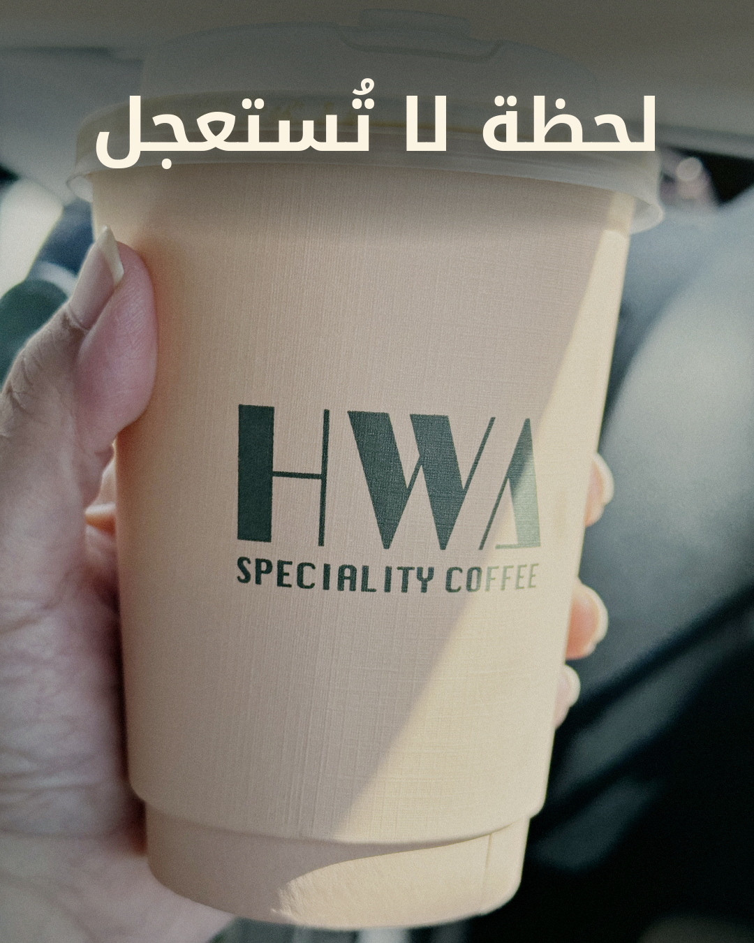
1) Is the Arabic headline sharp, readable and well placed? Any glyph errors?
2) Is the top band too dark / empty / dead?
3) Does the coffee cup look bright, sharp and premium, or dull and muddy?
4) Name anything that looks like a bad edit, banding, or an unnatural artefact.